Maps of population density and trends
The Breeding Bird Survey (BBS) provides national population trends for over 100 species. Here we show how BBS distance-band counts can be used to map the abundance and trends of 49 bird species across the UK, using statistical models. Read how maps of population density and trends are produced, in work carried out by Dario Massimino and colleagues.
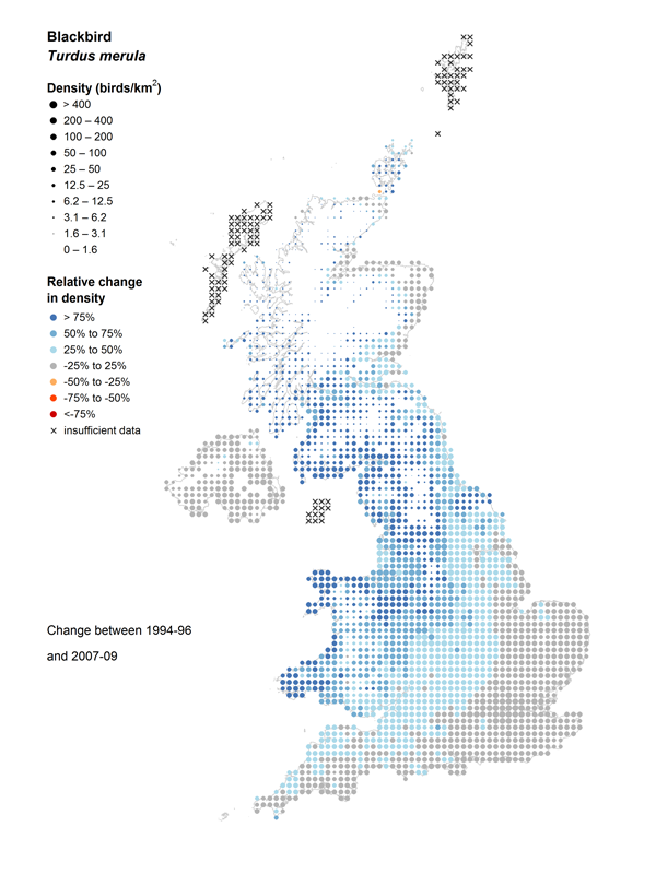
Scroll down to see the maps. For each species we present two maps:
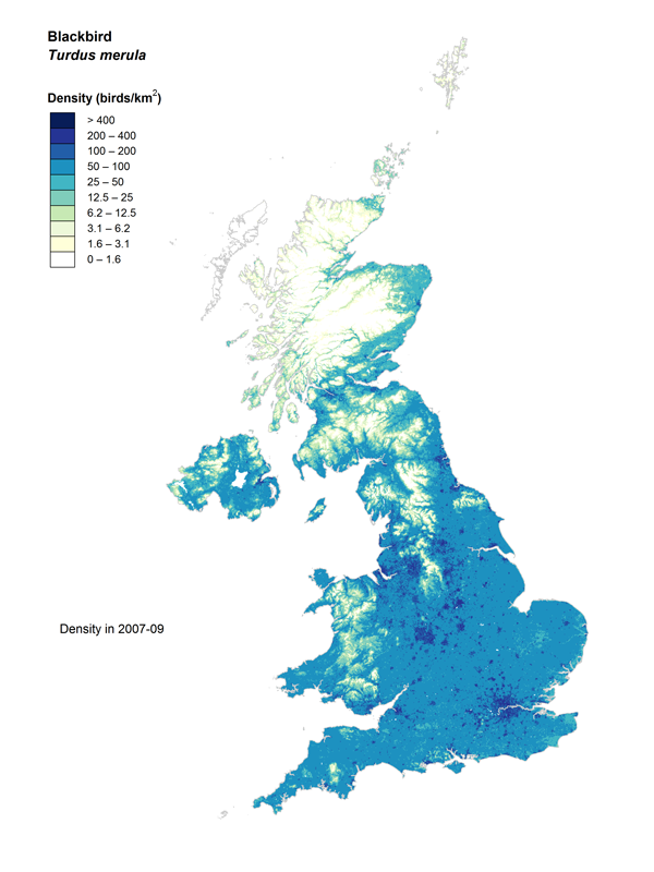
Density: The average population density during 2007–2009. Darker colours correspond to higher density. These maps show where a species is most common.
Change: The change in population density between 1994–1996 and 2007–2009. Increases are shown in blue and declines in red. Dot size indicates average density.
"Health Warning"
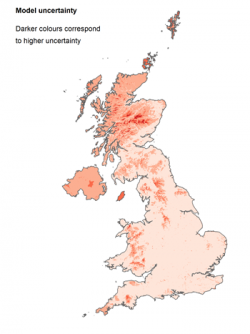
- The statistical models used to create these maps are less reliable in areas where few BBS squares are surveyed. The darker areas on the map to the right show where our estimates are less certain, including Northern Ireland and some islands. Please consider this when interpreting the maps.
Consider taking up a BBS square to help reduce this uncertainty. - The maps use data to 2009, so will not represent recent population changes (e.g. declines caused by cold winters).
- Some species were better modelled than others, with estimates for Kestrel and Cuckoo having the greatest uncertainty.
Read more on the limitations of the models used.








Share this page